Let's imagine a lead and a business opportunity together as part of widgets and reports.
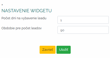
Thanks to the following widget, you will have an overview of the current one status of leads within the company. The widget allows you to track the total number of new, open or pending leads. With this new widget, you will always have at your fingertips all the essential information needed to effectively manage your store. First of all, as with other widgets, it is necessary to upgrade this one as well. We will determine the number of days for handling the lead and the period in which we want the data on the number of leads to be processed.
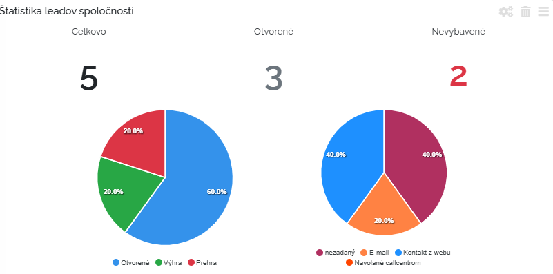
It will then be created for us company lead statistics. We can find in it how we see the total numbers. But also individual leads broken down by status: open, win and loss. And also the source where the lead comes from. Whether it is e-mail, the Internet or a call center, or another source. This widget really allows us to have an overall overview of leads.
Let's take a further look at the reports related to leads and business opportunities.
The first report we imagine is analysis of business opportunities.
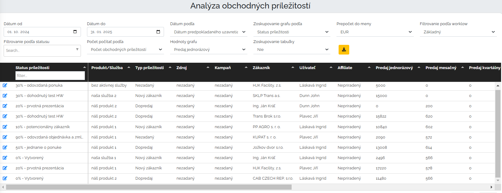
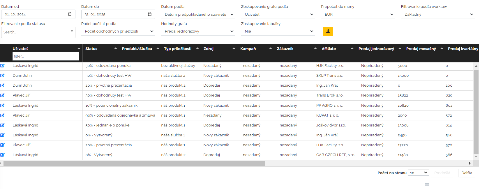
In their work, traders of course fulfill different business opportunities in mango, with different data. There is a lot of data in the business opportunities section, and if we want to analyze this data and work with it further, then this report is just for that. The first step in this analysis is that we have to profile what we want to analyze, what data we want to see. We will establish a date interface. Next, we choose whether we want to see the data according to the date of creation or closing. We also determine how we want the graph to be grouped. Whether by status or by user, campaign, source, service, etc. We will also determine the menu and workflow. Next, what values in terms of sales and profit should we include - whether monthly, semi-annual sales or profit... After setting up the parameters, we have a report on the world.
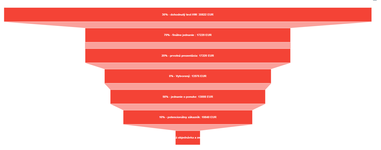
For this specific example, mango will create the so-called bar graph. Of course, I can also download these graphs to my computer as an image.
Let's now imagine the second report together and that's it analysis of the success of business opportunities.
In the first report, we analyzed business opportunities by status and users. In this second type of analysis, we look at how, how successful our business opportunities are. I will also set the parameters of the analysis in the introduction. Date range and date according to which event, further chart grouping according to various criteria such as user, product/service, etc. We can also define the workflow and whether we want to group the table. Let's look at an example. We set a period of time, according to the date of creation. Group the chart by user and we have defined the basic workflow.
In this case, too, the same table functions apply as in the examples above. A graphical representation of this example would be as follows.
We can see in an overview graphic display how many business opportunities for which users for a defined period of time ended in a win and how many in a loss. Based on the analysis, I can filter various parameters that I need to be reflected in a tabular view and a graph. It is only up to the manager according to which he wishes to compile the analysis.
