Let's imagine widgets and reports that analyze the economic situation of our company.
If you are interested in a quick overview of how your company is doing, or individual merchants/sellers, then these widgets are the right choice. You will find out what sales or profits you achieved during the set period, how much profit was brought by which trader, or you can track the most interesting orders according to the selected criteria. Let's see which widgets these are.
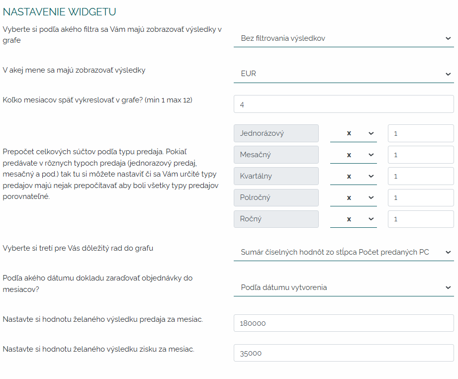
1. Development of sales and profits according to the selected filter. Let's set up a widget together that will clearly process a graph for us in relation to the set KPI. So, in the widget settings, we choose the time frame, the currency, how many months back to draw the graph, recalculate the totals according to the type of sale - sometimes a company has different forms of sales that it wants to incorporate into the graph and unify them. Next, we will select the third line of the graph in our example, it will be the number of orders. Subsequently, according to which date of the document to sort the orders, whether according to the date of completion or fulfillment, etc. And we set our KPIs for sales/month and profit/month.
After entering the criteria for graph processing, a beautiful clear graph will be displayed, which will show us the development of sales and profit in relation to the set KPI. At the same time, we will see a curve of the number of orders in relation to these values.
Of course, I can move this graph according to the months in the timeline. I can zoom in on it, save it as an image and change the criteria as needed. If I point the cursor at sales in the header of the graph, only sales will be displayed in the graph, if at profit, then profit, etc.
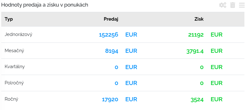
2. Sales and profit values in offers. If you want to have an overview of the value and profit in the issued offers, then this widget is for you. Just set the parameters. Let's get to it. We will choose the first filter according to which we will choose what offers we want to see in this widget. Either all or offers that have been created or sent. We will then choose a menu. And then the type of sale.
Will display a clear table with the values of sales and profit that we have in the offers we have chosen, depending on the type of sale.
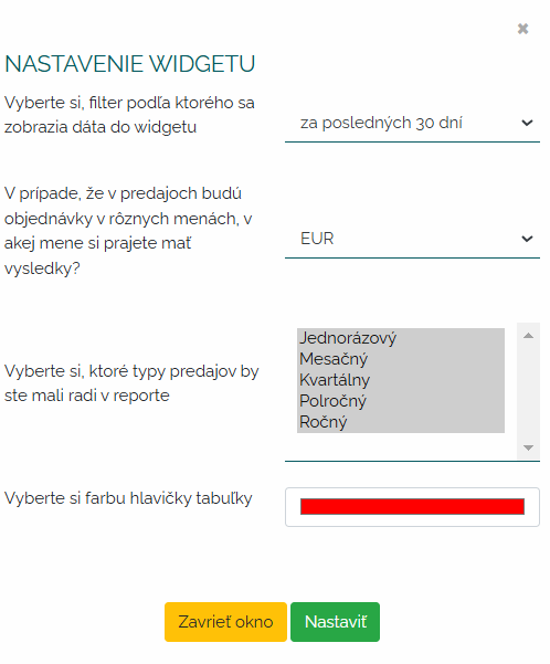
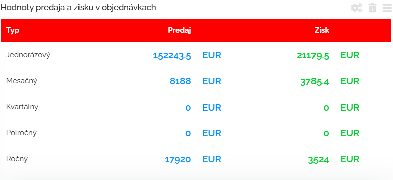
3. Values of sales and profit in orders. If you want to have an overview of the value and profit of issued orders, then this widget is for you. As in the widget above, you need to set the parameters. We set the period for which the widget should be processed. Next, we will determine the menu. Subsequently, the type of sale that should be in the widget.
We will see a table of the value of sales and profit in the orders we selected with the corresponding type of sale.
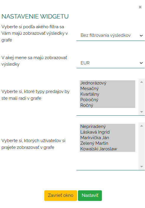
4. Sales/profit/number of created offers by users. Thanks to this widget, you will have an overview of how merchants are doing in relation to offers. What offers do they generate, at what values, with what profit. At the same time, you will be able to easily compare how many offers are generated according to the filter you selected. Let's set up a widget. We will determine which offers we will display in the widgets, whether they will be sent offers, created offers or all of them. We choose a menu. Type of sale and users.
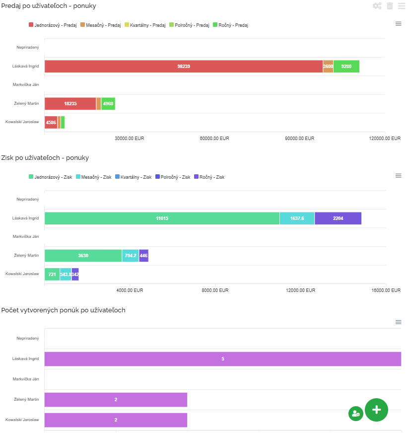
After setting the criteria, the following data will be displayed.
We have prepared three beautiful bar graphs where we can compare sales by users. Whether it is a monthly, one-off sale, etc. Furthermore, we can see how much profit is generated by users in the offers we have chosen and the number of these offers. I can click on the individual headers in the graphs and I will see what I need. I can save all graphs as a photo on my computer.
5. Sales/profit/number of created orders by users. Thanks to this widget, you will have an overview of how merchants are doing in relation to orders. What orders do they generate, in what values, with what profit. At the same time, you will be able to easily compare how many orders are generated according to the filter you selected. Let's take a look at the settings of this widget. We set the period for which we want the orders to be included in the widget. Then we choose a menu. Then the type of sales and users.
The criteria for processing widgets are quite clear and the user has no room for error. He can try different processing combinations and find out for himself which data is most important to him. Again, three bar graphs were prepared for us, where we can compare the values of sales by users that we have in our chosen orders, as well as the values of profit. And finally, the number of created orders by users. I can click on the individual headers in the graphs and I will see what I need. I can save all graphs as a photo on my computer.
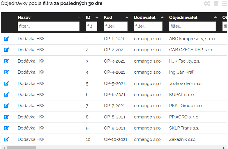
6. Orders according to the filter for the last 30 days. This widget allows you to keep track of orders. On the bulletin board within this widget, we will see all current orders, which allows us to quickly respond to customer needs. The widget provides detailed information about the status of orders, so we can quickly see which orders we have processed, sent or which are waiting for processing. Let's set up this filter together. First of all, we set the filter according to which the orders are to be collected in the table. Then we define the columns we want to see in this widget. And finally, how many records (lines) do we want per page. 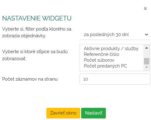
After profiling the widget, we will see a clear table that I can work with. I can filter in it, I can change the order of the columns, I can open the details of the order through the pencil symbol, I can turn off and on the display of the columns I need and vice versa. In one widget we have a beautiful overview of our orders that we need to see.
Sales report
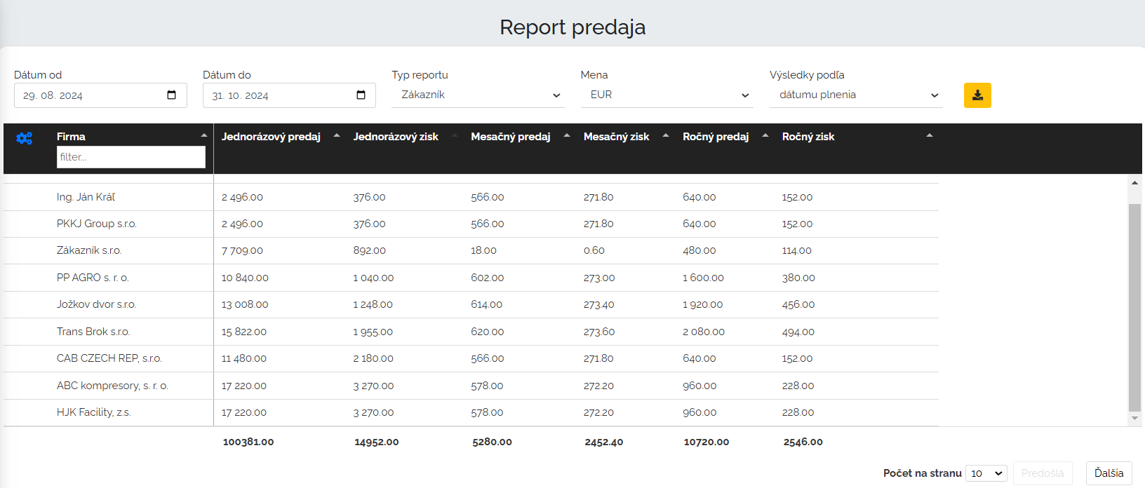
This block of widgets also includes a sales report. Let's take a look together at what the sales report contains. First, I set the parameters that we want Mango to process for us in the report. I will set the period, then whether I want the report to be processed according to the customer or user - type of report. Next, I set the currency and parameter according to which I want my results to be processed, or according to the date of completion, acceptance, fulfillment, etc.
According to the selected parameters, Mango will prepare a clear table for us in which the data will be processed either by companies or users. In our example, we have a filter by companies and results by fulfillment date. I can move the columns, sort the values in them.
Under such a tabular display, mango will also process a column graph of the criteria we set.
Working with this chart is interactive. What I click on in the header is highlighted for an even better overview. What I change and modify in the table will also be modified in the graph. If I unclick in the header of the graph that I don't want to see, the data will be hidden. See for yourself how fast, simple, and clear processing of this report is, and how Mango can provide us with accurate data on the important economic status of our company in a very short time.
This section is really comprehensive. It offers a large package of widgets and reports that are authoritative for the financial analysis of our business. See for yourself and see how Mango can evaluate your business and how it cleverly collects data and analyzes the weak points of your business.
