Let's take a look at how quantitative statistics help improve business processes and what is included in this section.
If a company wants to purchase graphic widgets for the directory section, it will find the following widget options in this package:
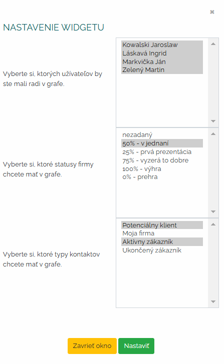
A) Number of companies in the directory - possibility of configuration according to status, user and type.
With this widget, in the initial settings I choose the users I want to have in the graph, I also set the status of the company we are interested in and the type of contact. Please note that these examples are purely illustrative. What the company chooses there, what kind of scaling is up to it.
So let's say that we want to graphically display the companies of all users, where the status is in negotiation at 50 percent and the contact type will be active client or potential. A few clicks and I have a finished graphic report. Creating documents for meetings and analysis has never been easier.
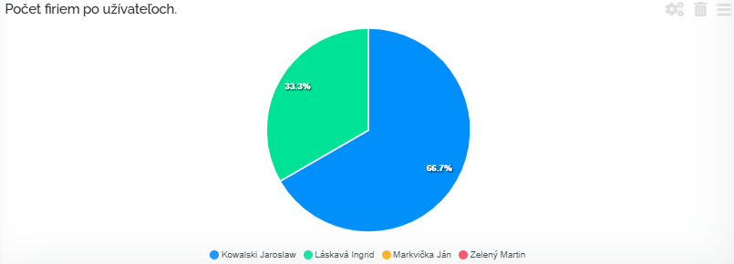
B) The number of companies that were not contacted in time - possibility of configuration according to the number of days and users.
With this widget, in the initial settings, I choose the users I want to have in the graph and then I want to choose the number of days after the contact date. This widget simply tells us that when the merchant decides to contact the company, for example 03.11.2024 and this contact will not happen, so in this graph it will appear as an uncontacted company. So these are companies that the trader forgot to contact, or for some reason no further activity took place with the company within the set deadline.
In this graph, we can clearly see that, for example, Mrs. Láskavá has 2 companies that are 4 days after the contact deadline.
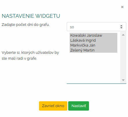
C) The number of companies that were created - the possibility of configuration according to the number of days back and according to users.
With this widget, in the initial settings, I choose how many days back I want my data to be processed. At the same time, I choose which users I want to see in the graph.
So I want to see how many companies Kowalski, Láskavá, Mrkvička, Zelený created in the last 10 days. A few clicks and clear statistics are available. I can set as long a time period as I need and it is up to me whether I need all users or just some.
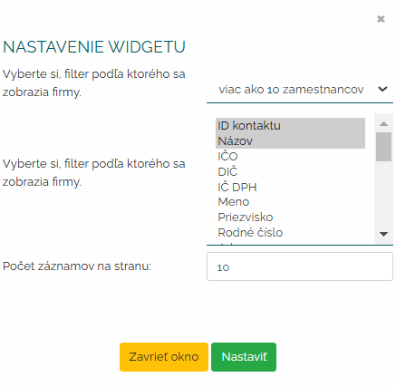
D) Setting a filter for a list of certain companies.
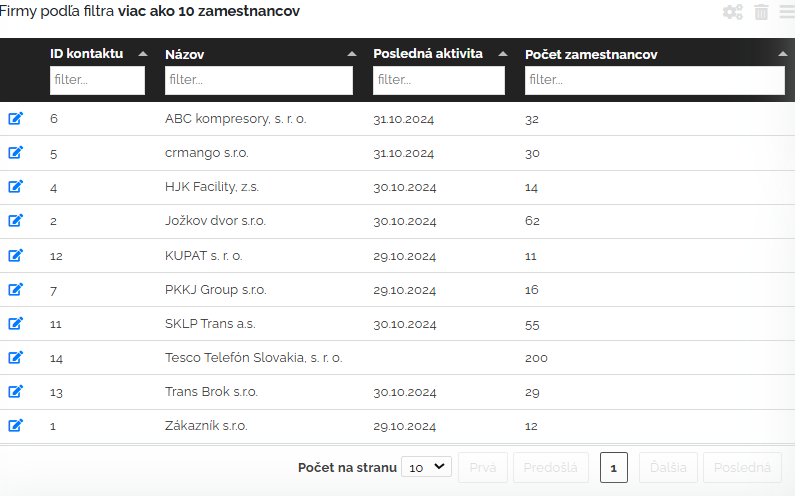
With this widget, in the initial settings, I choose the filter according to which I want companies to be displayed. I can choose any indicators in this filter. What a specific company needs to monitor. In our example, we chose companies that have more than 10 employees. Then we choose what we want to be displayed when the companies are filtered - what data we want to see about these companies. We want to see the ID of the contact and its name, then when the last activity was performed, then the number of employees. And in the last filter we determine how many records (lines) we want to have per page. In our illustrative example, we set 10.
In this way, the user can very quickly build up the list that he most often needs to see, and he always has it clearly and up-to-date on the bulletin board, and he does not have to click and filter anywhere anymore.
It is important to mention that you can filter all these columns directly in this widget and search for e.g. by name, ID, etc. You can change the columns and arrange them as you need. Via the pencil symbol at the beginning of the line, you can click on the details of the company and view additional information about the company. You will see a classic client card with information about the company, activities, tasks and everything related to a specific company.
So these are all the widgets binding to the directory widget package. Clever, what do you say?
