Who? What? How much? When? - let's answer these questions together.
We deliberately started this section with questions because the answers can be found in the widgets that are part of this section.
1. Timeline of users - configurable according to the type of activity, user and number of days back
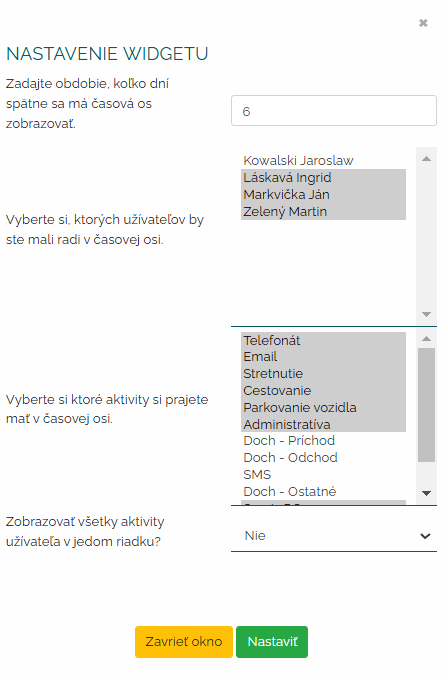
The first widget that is part of this package tells us about workload our team. When is it busiest and when is it the other way around?. In this widget, we can clearly see in the timeline what types of activities were engaged in by which user at which time. Of course, it is not only about classic activities such as e-mail, meeting - but also its own activities, that is, whatever the company sets in its own activities it can project in this timeline. I'm a graphic designer and I need to know how much I did on the last project? In this timeline, I can look at it according to the type of my own activity, for example - creating a website. How many hours did I work on it and how many hours should I invoice the customer. First, we set the parameters of the widget. That is, how many days back do I want to see these activities, then I will determine which users and what types of activities and whether to display the user's activities in one line. It is up to each of you which time period you choose, whether you choose all users or only some, as well as whether you choose only some types of activities that interest you.
When I profile the basic parameters of this widget, then I see such a beautiful graph in a clear timeline.
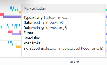
Of course, I can zoom in on the graph, move the timeline, I can download this graph to my computer as an image, and when I look at any color in the graph with the mouse, a pop-up window with activity details will also appear.
2. Number of hours recorded in activities - configurable by type of activity, user and number of days back
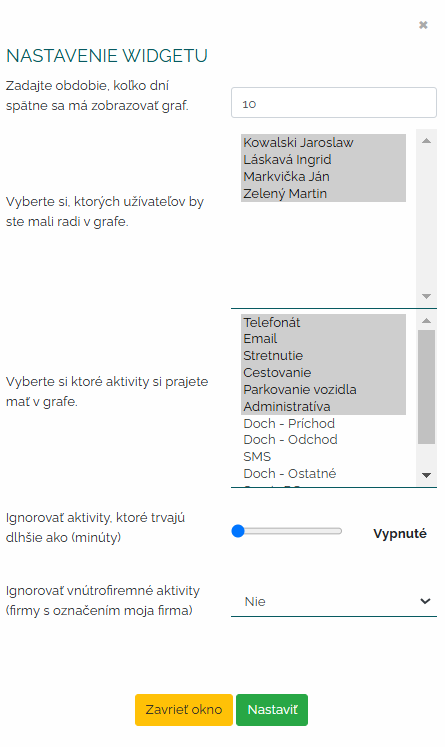
If you are wondering which of your colleagues has the most hours worked in activities then this is the widget for you. In this widget, we will see who is the most active and who is not. It is a smart analysis that can help us work on higher productivity those users who get the short end of the stick. Let's first imagine the initial setup of this widget. Even with this widget, we determine how many days later the graph should be processed. We also determine the users we want to see in the graph. Next, we determine the type of activity - we may not necessarily be interested in all of them, for example, such arrivals and departures may not have an informative value for us in this graph. Furthermore, I can set whether I want to ignore internal company activities under the label my company. Some managers may not be interested in these activities and may distort their results. And I can also set a minute frame, which means if I want to record in the graph also those activities that last more than XY minutes.
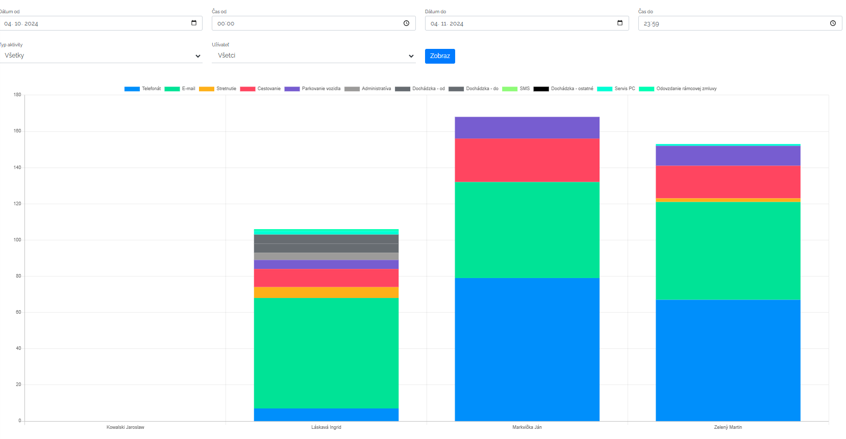
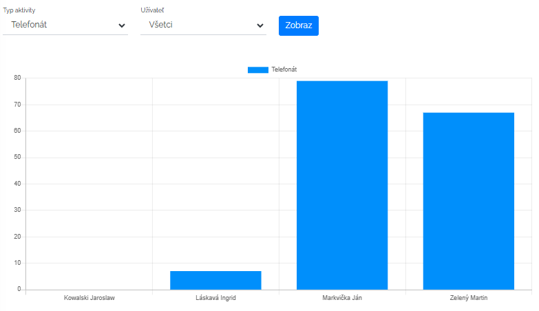
After determining the initial criteria, mango will prepare a clear bar graph for us with the required data. We can configure the graph as we want. We can target only one type of activity and compare data for all users. For example, how many hours have all traders spent in meetings in the last month. There are countless configuration options and it is up to each manager what types of data he needs to extract from the chart.
3. Number of activities - configurable according to activity type, user and number of days back
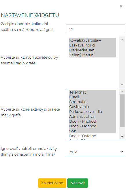
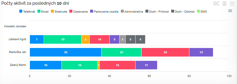
In this widget we find activity graph of all users. With its help, we can find out who had how many activities in the last period and we can track progress in their work commitment. Let's set it up. We will set a time frame. I can set this time frame up to a year ago. As with the last graph, we determine which users I want the graph to process and which activities I want to include in the graph. Also, as with the previous graph, I can choose whether or not I want internal company activities marked my company to be included in the processing.
After setting the widget, mango will once again process a clear bar graph for us according to the parameters we have chosen. Of course, I can save the chart again as a photo.
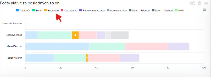
When I use the mouse cursor to aim at some type of activity in the header, only activities of this type are highlighted.
And again, we have a little more insight into the workload of our team, don't we? :)
Reports to the activity section
Two reports are also attached to the package of three widgets that we presented above. Let's imagine them.
User activity report. V in this report belonging to the above-mentioned widget packages, I can choose different forms and forms of the activity report that I want to be processed over a period of time. We can display four variants of this report.
A) All activities of all users for, for example, the last month. This report is the most summary, because in it we really see all types of activities that we have defined in the manga for all users for the last month.
B) All activities of one user. In this report, we decided that we want to see all the activities in a graphical overview at p. Carrot.
C) One activity for all users. On the contrary, here we decided that for a specific type of phone call activity, we are interested in the values for the last month for all users.
D) One specific type of activity for one specific user. And in the last case, we were interested in one type of activity, a phone call with one user Mr. Green for the last month.
User load report. This second type of report will process data from activities and show us how busy our work team is, what they have been doing. The time period for processing this report is max. for 40 days retroactively and I can choose whether I want to see all users or only some. The graph processes all types of activities that we have in the manga and assigns them to the timeline.
I can work with this report. I can save it, zoom in as I need. For example, we zoomed in on Oct. 29. In detail it looks as follows.
As we can see, the package of widgets and reports for the activity section is really comprehensive and will help the manager create the kind of overview he needs.
